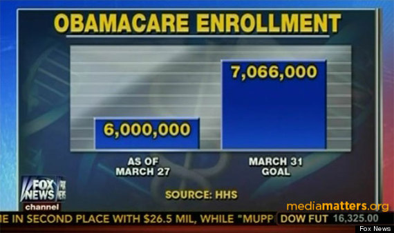
The graphic above was used by Fox “News” to show the “vast” discrepancy between the March 27 Enrollment and the target for March 31st.
Please note that in order for the left bar chart to represent 6 million, then each of the white background lines must represent 2 million. Since there is a difference of over 5 additional white background lines between the left bar and the right bar, then the right bar is really representing over 16 million, but the graphic says it is representing the 7,066,000, the actual March 31st target.
In effect they are trying to demonstrate that 6 mllion is 3/8ths (or 37.5%) of 7.6 million, when in reality it is 84.9858357% of 7.6 million.
Therefore, much like in South Park: I call shenanigans.
Fox has apologized for the “Mistake”.
Fox news graphics have a strong tradition of being misleading, mistaken, or outright lies. If you asked the people responsible for them what their sources are, I bet the answer would be “They come to us in dreams.”
…called “the bottomless zero”. In order to show a huge disparity between two sets of numbers when no such disparity actually exists, you create a chart like this, where the zero line is somewhere in the next county.
For the graph to make sense, each white line represents another 200,000 people. The 1,066,000 people between the 6 million number and the target number is therefore a little more than 5 white lines. That means they started the graph at 5.4 million, which is 90% of the 6 million. It’s like saying getting 100 on the test is 3 times higher than getting a 93, because you started the graph at 90.
If you did the 2012 election results like this, starting at 47 percent, President Obama’s total would be like the Empire State Building and Mitt Romney’s like the the detached garage behind my house. I’m guessing Fox didn’t use that graphic.
…that’s just beautiful! See it here:
http://www.dailykos.com/story/2014/04/02/1289127/-Hey-Fox-News-This-Graph-Says-It-All?detail=email