From Gallup:

In September, Americans are most likely to name dissatisfaction with government, the economy and immigration as the “most important problem” facing the country, although no one issue is named by more than one in five Americans. Mentions of the government and immigration are up slightly from August.
and:
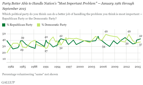
In a follow-up question, Gallup asked Americans which political party they thought could do a better job of handling the problem they named as most important, and the Republican Party emerges with a slight edge. Specifically, 42% of Americans say the Republican Party would do a better job, while 37% say the Democratic Party. Another 23% volunteered that the parties would do the same job, that a third party would do a better job or had no opinion.
I had to stare at this graph a little while to make sense of it. I find the timeline a bit odd … three-year intervals? It’s almost as if it was intended to make it hard to see the boundaries that matter to American politics.
Similarly, leaving the “same” responses off the graph strikes me as perilously close to outright deception. In my view, people who say the two parties are “the same” are as irrelevant as those who don’t respond. I think the graph would be more informative if the two quantities plotted summed to 100% for each point on the graph. This would have the effect of amplifying the differences.
Having said all that, I find it interesting to compare the plot during the Reagan years (1980-1988, the George H. Bush years (1988-1992), the Clinton years (1992-2000), the George W. Bush years (2000-2008), and the Obama years (2008-present).
The Reagan years appear to be a see-saw. Support for his party plummeted for the first years to an initial low in 1982, then climbed steadily until 1985, then declined again until 1988. It looks to me as though he enjoyed the support of a majority of those who cared about half the time.
George H. Bush seems to have done slightly better, though he too saw a sag in the middle of his administration, a surge in 1991, followed by a decline.
The Clinton years show a significant advantage when he took office, with a brief reversal from 1994-1996. With the exception of that brief 2-year period, he enjoyed convincing support from the American public throughout his administration.
It appears that opinion during the George W. Bush years was split about as evenly as his contested election. Astonishingly, in 2004 (when he won re-election), this graph suggests that Democrats enjoyed a popular advantage.
Not surprisingly, the Great Recession of 2008 persuaded, at least temporarily, a large number of voters that Democrats were preferable. Barack Obama began his first term with the largest popular advantage visible on the graph. He received a second bump just after his re-election.
Since obtaining power in 2012, the GOP has been in decline (and the Democrats surging) since then, though with a brief uptick at the end of last year (apparently the mid-term elections).
A few highlights strike me:
– This graph confirms that Bill Clinton sustained popular support more effectively than any of his peers, in spite of relentless partisan attempts to destroy him
– Ronald Reagan was not nearly so popular during his administration as subsequent attempts to beatify him suggest.
– Barack Obama started with — and subsequently lost — the strongest support of any president in the last 30+ years. This graph would suggest that Mr. Obama is much better at campaigning than at governing.
I suspect historians will have a field day explaining the causes of that last observation, ranging from “He was politically assassinated by a racist media, political system, and society” to “He was a hopelessly inept politician who betrayed his supporters and failed to capitalize on his popularity”.
I appreciate the interesting post, even though it did just burn an hour of my life. 🙂
.